Our Patented GDT Report for Thoroughbred Breeding
This patented GDT Report is the only report of its kind in the thoroughbred breeding and racing industry
Here’s How the GDT Report Works
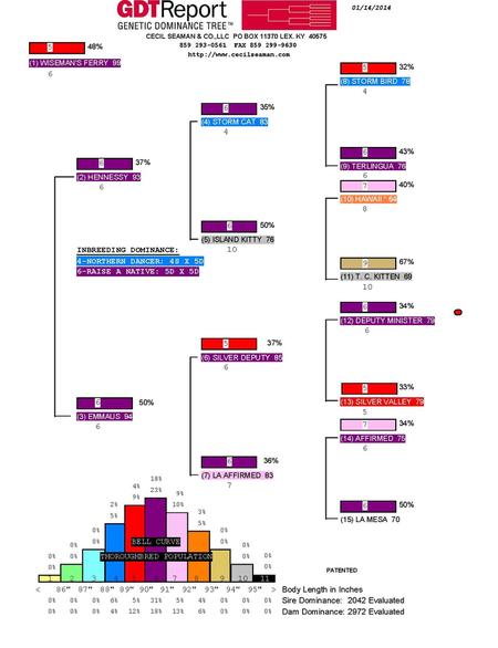
A good GDT Report shows consistent color throughout the pedigree, like red, pink and purple, or orange, tan and black. This indicates a horse produced from a family of horses of similar size and length. This horse will have a high probability of being a stakes producer when bred to horses with similar GDTS. Conversely, a poor GDT Report, which shows inconsistent color throughout, indicates a hybrid-type horse that comes from a family of disparate sizes and lengths. This type of horse has a very low probability of being a successful producer because there is no identifiable familial pattern to reproduce. The following GDT Report shows a good, consistent family.
How to Read the GDT Report
- The GDT Report reads like a five generation pedigree but uses color to indicate size and length in a family. These colors correspond to the bell curve information found on the bottom of the page.
- The name of the subject horse is in the upper left-hand corner.
- On the Sire side, the Sire’s name and age are encoded in color. The number below the name is the color size number. For example, purple is 6. The box above the Sire indicates the dominant size of the foals he produces most consistently, with the percentage of foals falling into that size to the right of the color box.
- For the Dam side, the mare’s name appears with her birth year. The color box above her indicates the dominant size of the measured foals out of the mare, along with the percentage of time she produces it. To the left of the Sire and Dam’s names are the internal sequencing numbers. For example, the subject horse is (1), the Sire is (2), and the first Dam is (3), etc.
- The bell curve at the bottom of the page is based on the total thoroughbred population from our database of over 114,000 measured horses with the horses in the middle representing the largest part of the population size and length-wise and the horses to the outside being extremely large or small.
- The eleven-color scheme represents the range in body length of the horse (from <86 inches to >95 inches). A number is also given for each color (1-11).
- On top of each color bar, two numbers (in percent) are shown. The top number represents the body length distribution for the first three generations of the pedigree while the bottom number represents the body length distribution for the fourth and fifth generations of the pedigree.
- At the bottom of the bell curve, the rows of numbers give the percentage of body lengths for Sire dominance and Dam dominance in the pedigree. Sire or Dam dominance takes into account the number of horses evaluated from the Sire’s or Dam’s family tree for the past five generations including the progeny.
There are many agents in the industry that can select a horse for you. But no matter how astute or experienced they are, their visual analysis cannot equal the information gained by physically measuring and scientifically evaluating a horse. Forty years of experience, a unique database and a phenomenal track record are at your disposal. Let Cecil Seaman & Co. measure your success, one horse at a time.

